
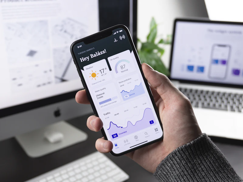
Micro-Interactions That Make Apps Feel Premium
Some mobile apps feel “premium” even when they offer the same core features as competitors. The difference is often not the feature set—it’s the micro-interactions: subtle, intentional responses to user actions that communicate status, reduce uncertainty, and make the interface feel alive. Done well, micro-interactions improve perceived performance, boost trust, and quietly increase retention.
This guide breaks down the micro-interactions that matter most in a Mobile APP, with practical patterns, implementation tips, and examples you can hand to a designer or engineer today.
What micro-interactions actually do (and why users notice them)
Micro-interactions are small moments of feedback: a button press that slightly compresses, a pull-to-refresh animation, a “saved” checkmark, a subtle haptic tap on a successful action, or an inline validation message that appears exactly when needed. They work because they answer the user’s constant questions: “Did the app register my tap?” “Is something happening?” “Did I make a mistake?”
In practice, strong micro-interactions deliver three outcomes: clarity (users understand state), confidence (users trust results), and continuity (flows feel smooth rather than jumpy). The biggest ROI comes from critical journeys like sign-in, search, checkout, messaging, and saving/bookmarking.
Design principles: the rules that prevent “over-animated” apps
Micro-interactions can quickly turn into noise if they’re inconsistent or too flashy. A premium feel comes from restraint and consistency—small motions that reinforce meaning.
- Make feedback proportional: A small action (toggle) deserves small feedback; a big action (payment confirmation) can justify richer motion and copy.
- Keep timing tight: Many UI transitions feel best around 150–250ms; longer animations can feel laggy unless they’re clearly communicating progress.
- Be consistent: Similar actions should produce similar responses across the app (same easing, same success pattern, same error style).
- Respect accessibility: Support reduced motion, color contrast, and non-color cues for status (icons/text, not only red/green).
- Never hide state: Motion should clarify, not obscure. If something changed, make it obvious what changed.
Premium feedback patterns you can apply immediately
Below are high-impact patterns that improve UX without major redesigns.
1) Button press states that confirm intent
Buttons should visually respond on touch-down (not only on release). A subtle scale (e.g., 0.98), a slight darken, or elevation change confirms the tap was registered. For destructive actions, add a stronger confirmation step (sheet, long-press, or “hold to confirm”) to prevent accidents.
- Tip: Use the same pressed state across primary CTAs to build muscle memory.
- Example: “Save” button becomes a checkmark with a short spring animation and optional haptic success tap.
2) Inline validation that teaches, not scolds
Instead of showing errors after a failed submit, validate progressively. For email/password forms, show constraints early (“8+ characters”) and confirm success with a subtle indicator. Use calm language and provide the fix next to the problem.
- Tip: Don’t disable the submit button without explaining why; if disabled, show inline guidance.
- Example: Password field shows a live checklist that turns to checkmarks as requirements are met.
3) Skeleton screens and meaningful loading states
Spinners are better than nothing, but skeletons often feel faster because they show structure immediately. For feed-like content, skeleton rows reduce perceived wait. For action-based waits (uploading, verifying), show progress with plain-language status.
- Tip: If loading is under ~300ms, consider no loader at all—just transition smoothly. Flashing spinners can feel worse than a brief quiet delay.
- Example: After tapping “Place order,” show a stepper: “Confirming payment” → “Reserving items” → “Done.”
4) Haptics: tiny signals with huge perceived quality
Well-tuned haptics make interactions feel physical and intentional. Use them sparingly for moments that matter: successful toggles, message sent, item added to cart, biometric success, or an error bump for invalid actions.
- Tip: Map haptic intensity to importance. Avoid strong haptics for frequent actions or you’ll create fatigue.
- Example: Light haptic on “Like,” medium haptic on “Saved,” and a distinct error haptic on failed payment.
5) Motion that communicates hierarchy and direction
Motion should help users understand navigation: where they came from and where they’re going. Use consistent transitions (push/pop, modal slide, fade) that match platform conventions. When elements transform (like expanding a card into a detail screen), users perceive continuity and quality.
- Tip: Favor easing curves that feel natural (ease-out for entrances, ease-in for exits). Overly bouncy motion can read as playful rather than premium.
- Example: Tapping a product card expands it into the detail view, preserving the image position to maintain context.
Critical flows: where micro-interactions pay back the most
If you’re prioritizing, start with flows that directly impact conversion and trust. Improve these before polishing secondary screens.
- Onboarding and permissions: Explain “why” before the system permission prompt; confirm success with a clear state change and next step.
- Search and filters: Show instant feedback (chips, counts, subtle loading) and preserve scroll position when users return.
- Checkout and forms: Inline validation, clear processing states, and strong confirmation reduce abandonment.
- Sync and offline moments: Communicate saved status (“Saved locally • Syncing…” → “Synced”) to build trust.
- Error recovery: Provide retry actions and explain what happened in plain language, not codes.
Engineering checklist: making it smooth without making it slow
Premium feel collapses if the app stutters. Micro-interactions must be designed with performance and resilience in mind, especially on mid-range devices and poor networks.
- Protect the main thread: Avoid heavy work during animations; precompute layout where possible.
- Keep animations GPU-friendly: Prefer transforms (translate/scale/opacity) over expensive layout thrashing.
- Debounce taps thoughtfully: Prevent double-submits with clear disabled/loading states rather than silent ignoring.
- Design for network variability: Use optimistic UI when safe (e.g., liking a post) and provide rollback if the server fails.
- Honor reduced motion settings: Offer simpler fades or instant transitions when users opt out of motion.
A practical tactic: define a small “interaction spec” shared across design and engineering—timings (e.g., 180ms), easing, haptic rules, loading patterns, and success/error components. This prevents one-off behaviors and makes the app feel cohesive.
Measuring impact: what to track beyond “it feels nicer”
Micro-interactions should move measurable outcomes. Pair qualitative feedback with metrics to validate improvements.
- Funnel conversion: form completion rate, checkout completion, permission acceptance.
- Error rates: validation errors per session, payment failures, retries.
- Rage taps: repeated taps on the same element can signal unclear feedback or slow responses.
- Time-to-complete tasks: search-to-result, add-to-cart, send-message.
- Retention signals: saves/bookmarks, repeat sessions, feature re-use.
Combine analytics with lightweight usability sessions. Often, a single confusing loading moment or unclear disabled button explains a surprising drop in conversion.
A simple rollout plan for your next sprint
If you want results fast, implement micro-interactions as a focused quality initiative rather than scattered polish.
- Pick one high-value journey: e.g., sign-up or checkout.
- Map states: idle, pressed, loading, success, error, empty, offline.
- Standardize components: one loading button, one inline error style, one toast/snackbar pattern.
- Add haptics intentionally: success/error only where meaningful.
- Test on real devices: include older Android and iOS devices; simulate poor network.
- Measure before/after: conversion, errors, rage taps.
Conclusion: premium is consistency, not decoration
A Mobile APP feels premium when every action has a clear, consistent response—especially under stress (slow network, errors, partial data, offline). The best micro-interactions are often the ones users don’t consciously notice; they simply feel that the app is fast, trustworthy, and thoughtfully made.
If you want one takeaway: define your core interaction patterns (press, load, succeed, fail) and apply them relentlessly across your most important flows. That’s how “polish” becomes product quality.


0 Comments
1 of 1